Blowfish Malibu Shoes
The task is to redesign a page from Blowfish Malibu shoe's website, to better improve the overall customer experience through research driven testing results, along with intuitive and smart design decisions. After assessing areas of improvement, it was determined that keeping brand consistency throughout the website + experience, having a selling hierarchy, and promoting a sense of community were key.
Current State
“Add to cart” should be prominent to the user, allowing for an easy and smooth shopping experience.
- Navigation under the product photos is unnecessary and confusing.
- Under the product photos, the “shop with friends” quadrant does not provide any information or interaction for the user and makes the page look unfinished.
- This page is a great opportunity to promote other products, showcase any relevant reviews or list shipping options, but none of those features were used here.
Enhanced Redesign
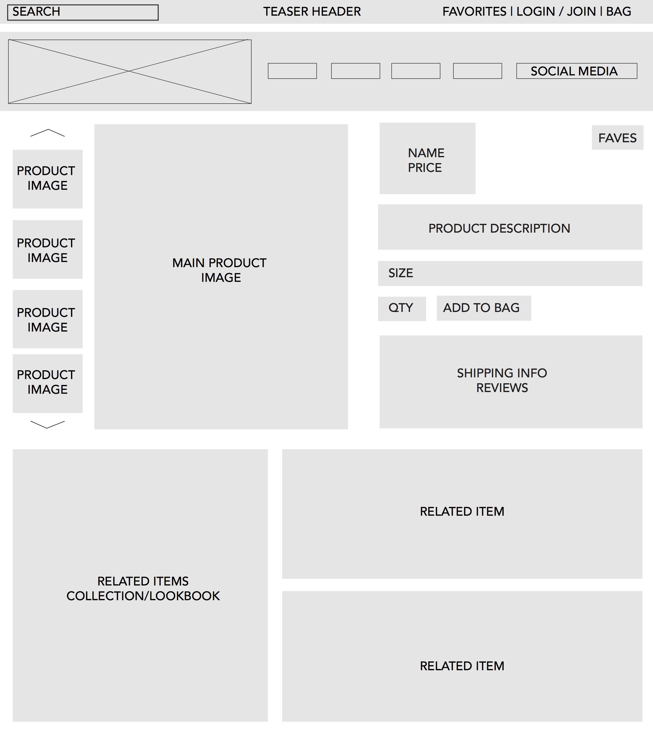
Added a “favorites” option, simplified “login/join” and “bag” icons for quick and easy identification.
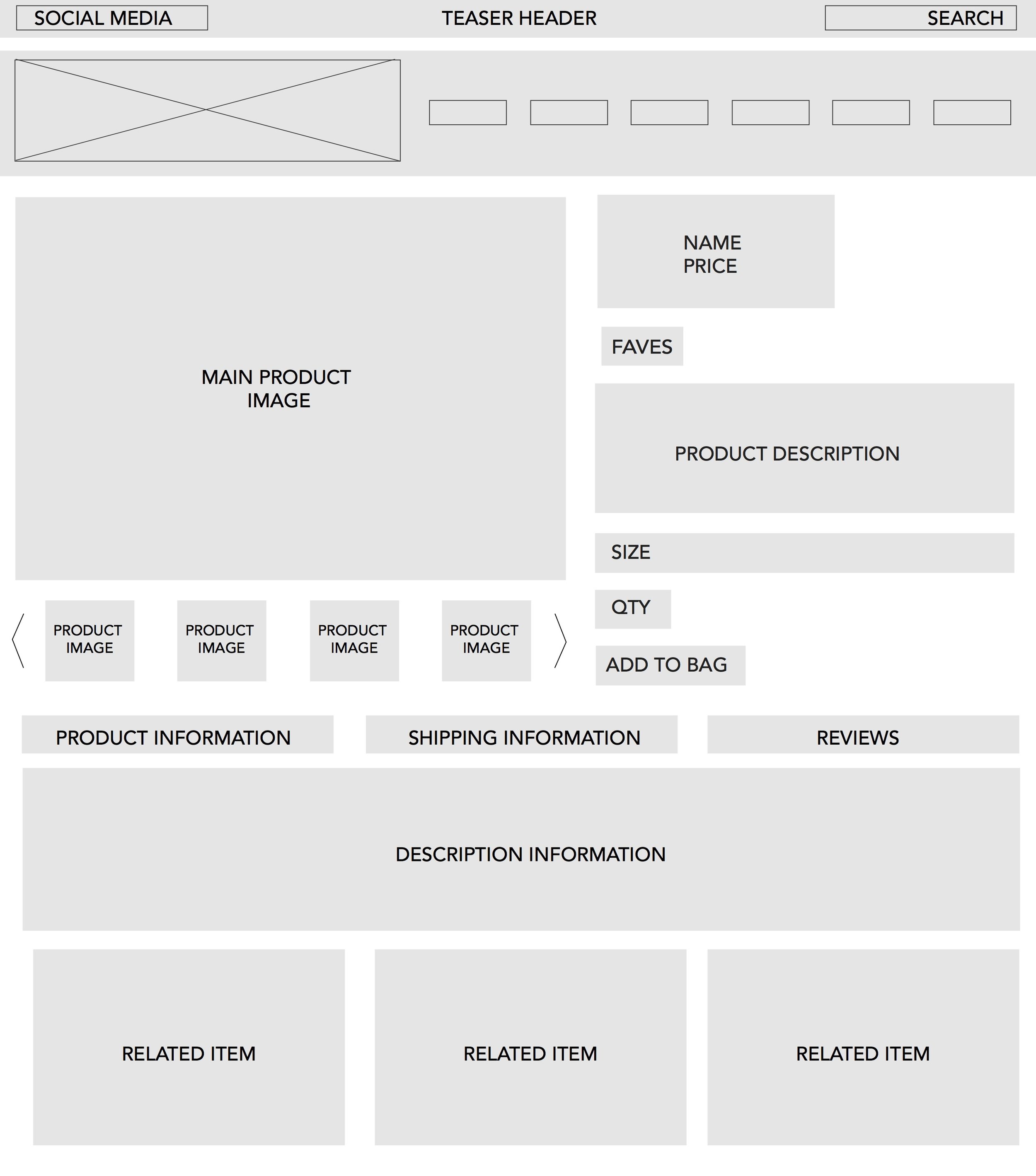
- To showcase the product description and to keep the page length short, accordion style menus were implemented, with drop downs for shipping information and reviews.
- Simplified sharing buttons for social media, and category tags were added to help searching within the site.
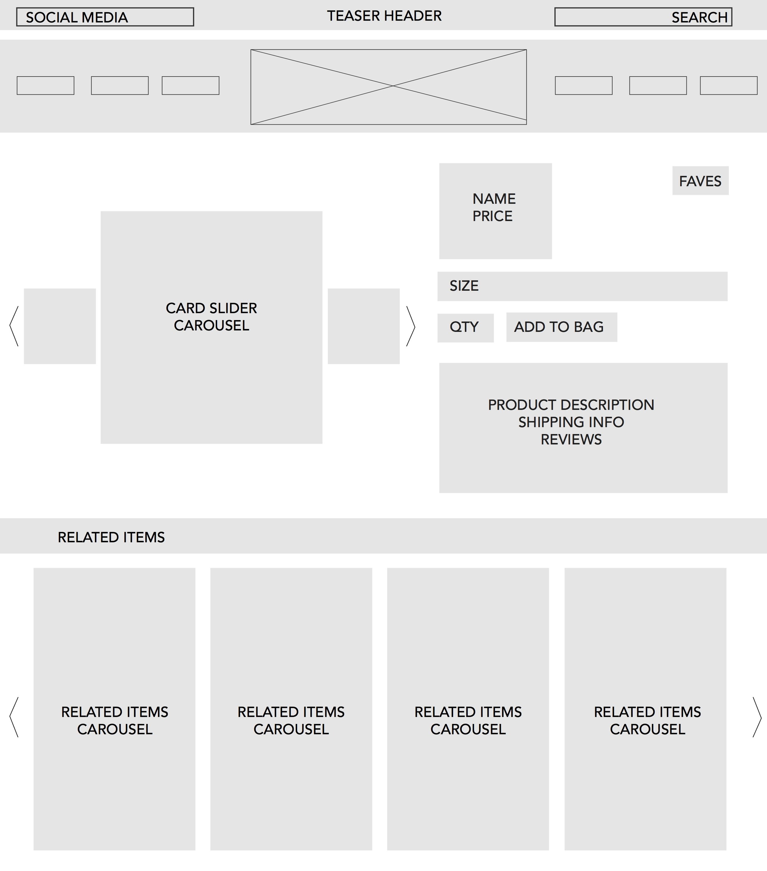
- A “related items” carousel was added to promote other products, along with suggesting similar styles.
When hovering over each item, a drop shadow helps the product to stand out. Also, on the image roll over “favorite” and “quick view” icons appear.
WIREFRAMES
Initial concepts of overall redesign of the website to include large product image, related product section, and links for favorites/bag/ login and join.


