QVC Checkout
Based upon shortcomings in today’s checkout flow, the following features are opportunities on how to overcome them. Utilizing current metrics, user testing, and many other means of research, the below designs incorporate a new user flow and a new feature set to allow for the easiest checkout process QVC can offer.
© Copyright QVC 2018
New User Checkout Flow
New Features Added
- Promoted a secure checkout and log in throughout the entirety of the checkout flow.
- Reinforcing the “backyard fence” tone with updated copy.
- Unified overall styles to better align with platform specific needs and streamlined UI.
- Minimized inventory status headers due to repetitiveness seen throughout the purchase flow.
- For better transparency, the delivery speed is included with S&H.
- Utilizing native styles where applicable (apps)
- Updated form design per platform to increase usability and accessibility.
- Form validation in real time.
- Renaming pages to product name rather than item number
Easy Pay Selection on PDP / Cart
- Within apps, having the ability to Sign In on the Cart page
Swipe to reveal Save for Later
- Prominent back button (web)
- Social Log In / Account Creation (web + apps)
- Android Fingerprint + Face ID (apps)
- Email and Password for account creation in one step (apps)
- Adding a “mini cart” feature within an accordion to reinforce the customer’s purchase (web)
- Address autocomplete utilizing an API such as Google
- Stylized segmented control for all possible payment methods (apps)
- Checkbox for utilizing the shipping address as billing
- Easy Pay selection on Order Review rather than a separate page
- Reminder/Notification for delivery status push notifications
Access to Your Calendar to set up order delivery reminders
Trove
Overview:
Name, brand and create an apparel subscription company, and build an iOS app on-boarding experience.
Process
Word Association
Through exploring with word association, the company name ‘trove’ was created.
Mission Statement
trove’s goal is to inspire her to be the best version of herself through the ability to easily acquire the wardrobe that embodies those values, through a touch of wanderlust, nostalgia and uniquely hand-crafted collectable pieces.
Mood Board
Keeping with a theme of one-of-a-kind, clean, airy, romantic, monochromatic with pops of color, approachable and incorporating hints of handcrafted details.
Creating a timeless, authentic and feminine brand.
Branding
After utilizing the processes outlined prior, I was able to create the brand “trove | wardrobe artifacts”. Keeping in mind the importance of font, color, and wording meaning, the trove branding was created.
Personas
Ellie Tyler, The Power User
Age: 22
Occupation: Writer
Education: Bachelor’s Degree
Status: Single
Location: Chicago, IL
Behaviors:
• Will use most of the native mobile functionality
• Likes customization and change
• Extends functionality with additional apps / software
Goals:
• Stay up to date on current fashion trends
• Be able to show her unique personality through her clothes
• Conscientious of money and overall price point
Scenario:
Ellie is a recent grad, looking to enter the corporate world without loosing her unique style. She is very aware of price points of clothes, but understands that with great quality comes with an expense. Because of this, she enjoys the idea of renting the clothes she lusts after while still being able to afford them.
Rebecca Clarkson, The Casual User
Age: 42
Occupation: Physician’s Assistant
Education: Bachelor’s Degree
Status: Married
Location: Pittsburgh, PA
Behaviors:
• Uses most native phone features
• Uses phone to make calls, send texts, take pictures, browse internet in downtime
• Always has phone with her
Goals:
• Wants to feel connected to current trends while still age appropriate
• Looking to find exciting new clothes, while still within her price range
• Wants to break the stigma of having to wear “mom clothes” at her age
Scenario:
Rebecca is getting bored with her usual stores and is looking for something new and exciting, that can offer her age appropriate clothes while still being on trend and current. The idea of renting clothes for her date night, work events, or weddings is alluring; she can “test drive” what she wants without spending all at once.
Flows + Wireframes
With many layers of this on-boarding process, having the correct flow is key. In knowing this, you must be aware of issues such as when account creation occurs in the process, how much detail is involved in the style quiz and price point and placement of membership sign up.
After creating the basic flow for the new customer on boarding process, laying out basic interactions and content was next. Figuring out what features would be best is crucial in this part of the process.
Thoughtful features + thoughtful design.
IOS
iPhone X
https://invis.io/ZJLWXB5TXPK
Forevermore Paper Co.
The first impression of any occasion is the invite and that's exactly what Forevermore Paper Co. specializes in with their own unique creative flair. Not wanting to be marketed as a traditional invitation and paper business, the branding for FP Co relied heavily upon having a modern twist on a traditional inspired logo.
All stationary designs + photography was done by myself, under Forevermore Paper Co.
Brandamant
The brand identity design for this project is inspired by the fictional knight heroine from two epic poems, Bradamante. As a line of fashion forward bodysuits, Bradamant serves to strengthen women as they go about their daily battles. While working with Bradamant, it was important to showcase the unyielding strength in the branding. This project includes: overall branding + packaging, and a spring look book.
Blowfish Malibu Shoes
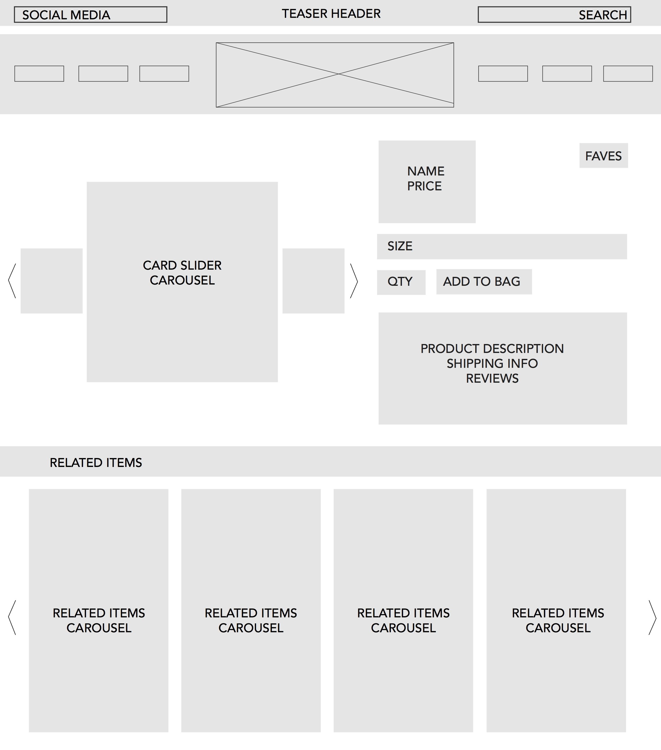
The task is to redesign a page from Blowfish Malibu shoe's website, to better improve the overall customer experience through research driven testing results, along with intuitive and smart design decisions. After assessing areas of improvement, it was determined that keeping brand consistency throughout the website + experience, having a selling hierarchy, and promoting a sense of community were key.
Current State
“Add to cart” should be prominent to the user, allowing for an easy and smooth shopping experience.
- Navigation under the product photos is unnecessary and confusing.
- Under the product photos, the “shop with friends” quadrant does not provide any information or interaction for the user and makes the page look unfinished.
- This page is a great opportunity to promote other products, showcase any relevant reviews or list shipping options, but none of those features were used here.
Enhanced Redesign
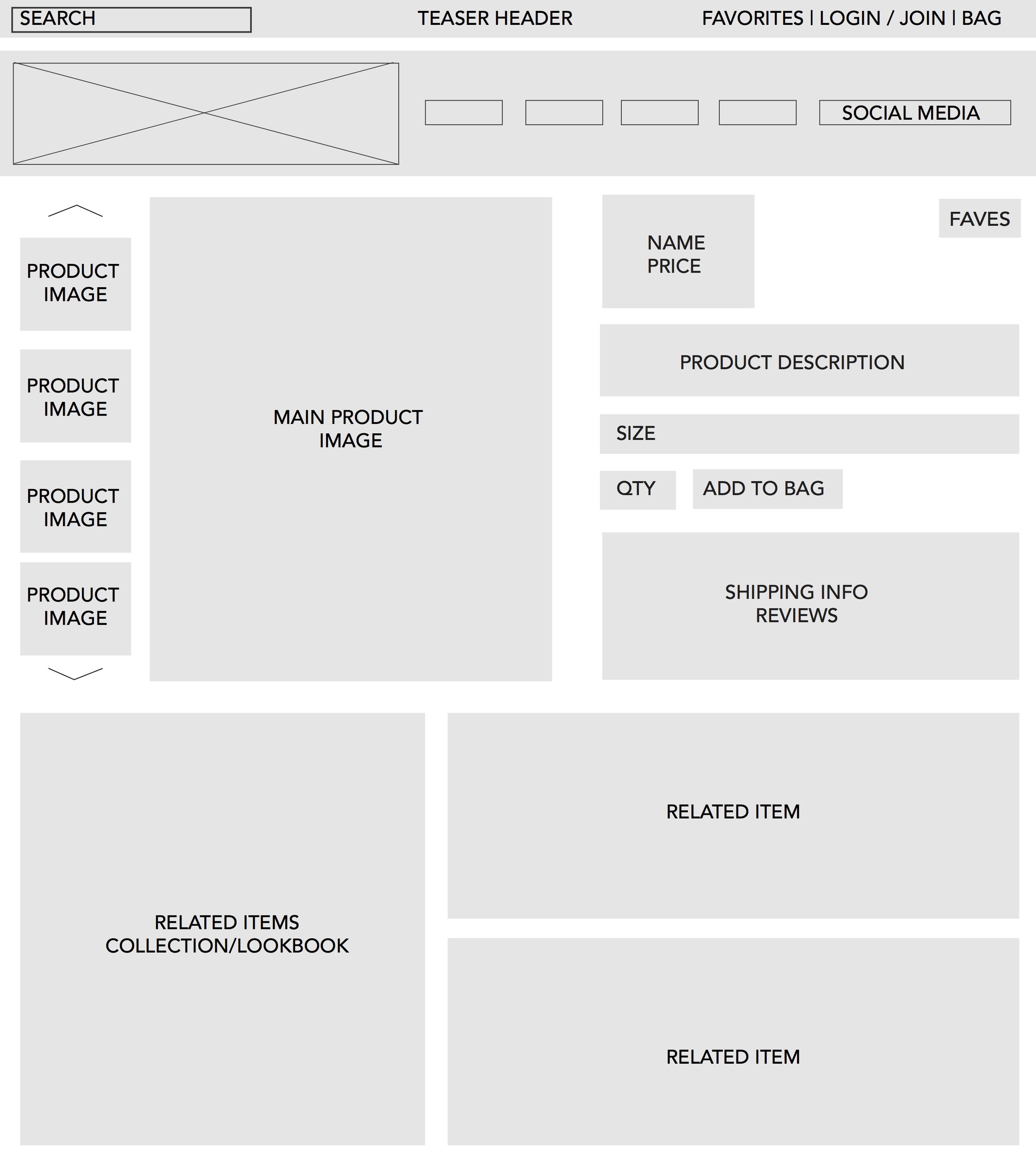
Added a “favorites” option, simplified “login/join” and “bag” icons for quick and easy identification.
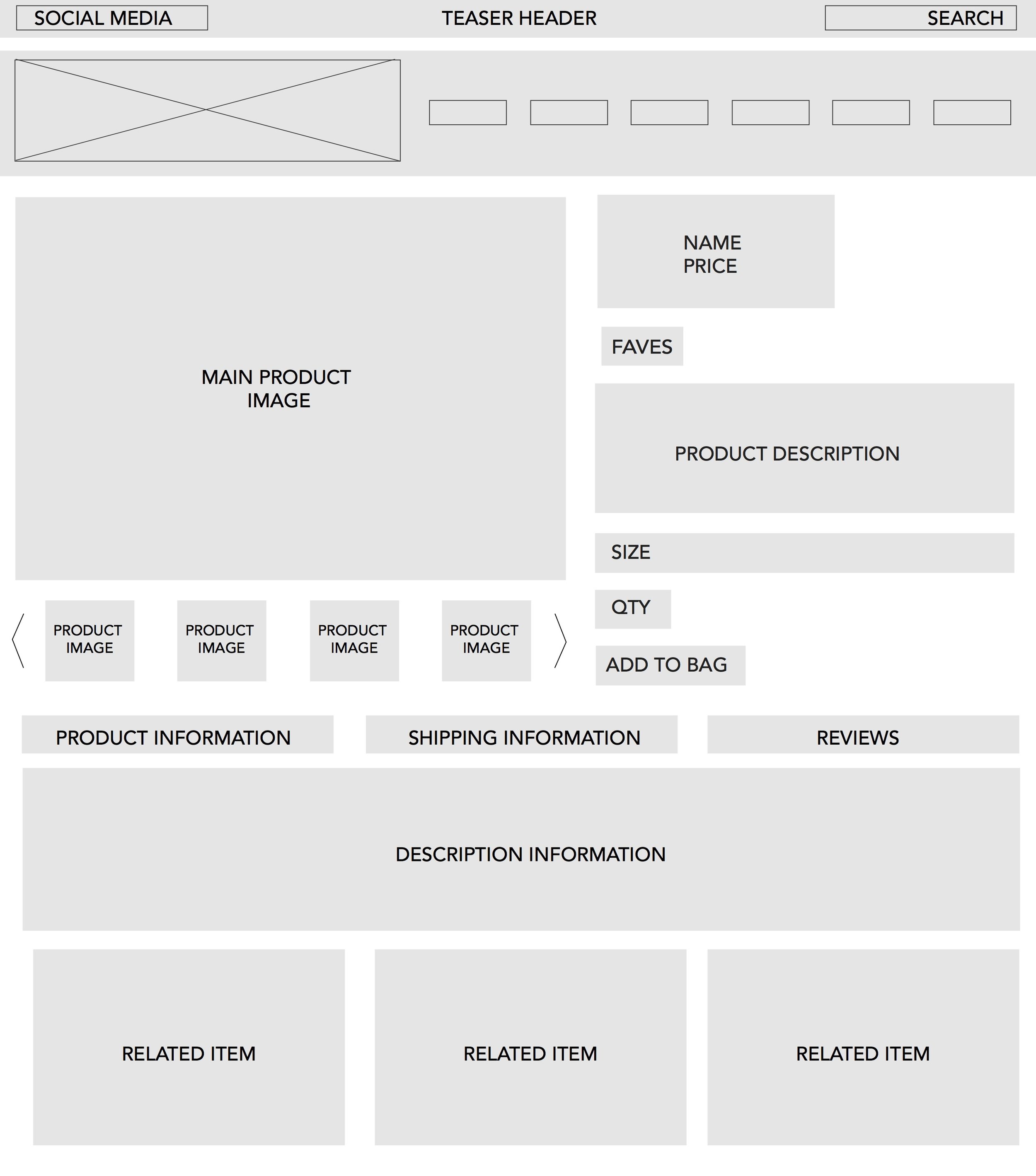
- To showcase the product description and to keep the page length short, accordion style menus were implemented, with drop downs for shipping information and reviews.
- Simplified sharing buttons for social media, and category tags were added to help searching within the site.
- A “related items” carousel was added to promote other products, along with suggesting similar styles.
When hovering over each item, a drop shadow helps the product to stand out. Also, on the image roll over “favorite” and “quick view” icons appear.
WIREFRAMES
Initial concepts of overall redesign of the website to include large product image, related product section, and links for favorites/bag/ login and join.
Wanderlust
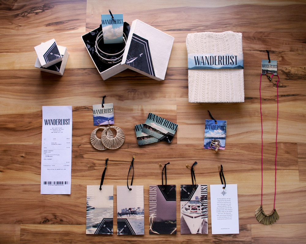
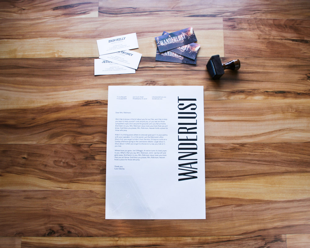
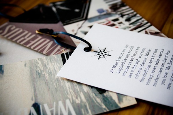
How do you build a brand merely on a feeling? Based upon combining the desire and allure of traveling along the idea of wonderment, Wanderlust was born. Drawing inspiration from everywhere, it was very important to showcase those values in the branding for this vintage boutique clothing company. Wanderlust is inspired by and for the vintage lover who needs some modern staples in her wardrobe.
Lush
A proposed rebranding of Lush Cosmetics, a fresh, mostly organic and vegetarian based cosmetic company. With this rebrand, I wanted to emphasize those qualities while still appealing to their broad target audience. With redoing their logo to mimic more of what is found on their website, their products feel more clean and contemporary. In addition to their current packaging, I created a package that would add to the personalized Lush experience. When deciding on what products to use, the consumer builds their own skin care regimen. At checkout, those products can be placed into the flower-like packaging that is then laced up. When undone, the sides fall down to mimic flower petals.
Rickie Freeman | Teri Jon
Created corresponding weekly e-newsletter + site landing page filled with a curated selection of special feature dresses. The e-newsletter has call to action topics to allow the customer to click through to the custom landing page for that week so they can browse and shop the site. Also, created a “custom picks” or a related items email template sent out as a follow up to customers to help with upsells, that was curated by the design team. Finally, while working with a team of developers, we updated the website to better improve the customer experience and overall design.
Chick-Fil-A
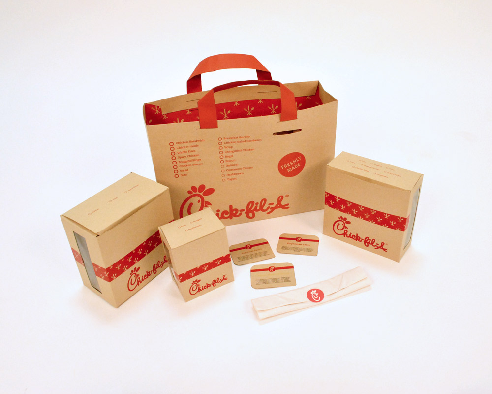
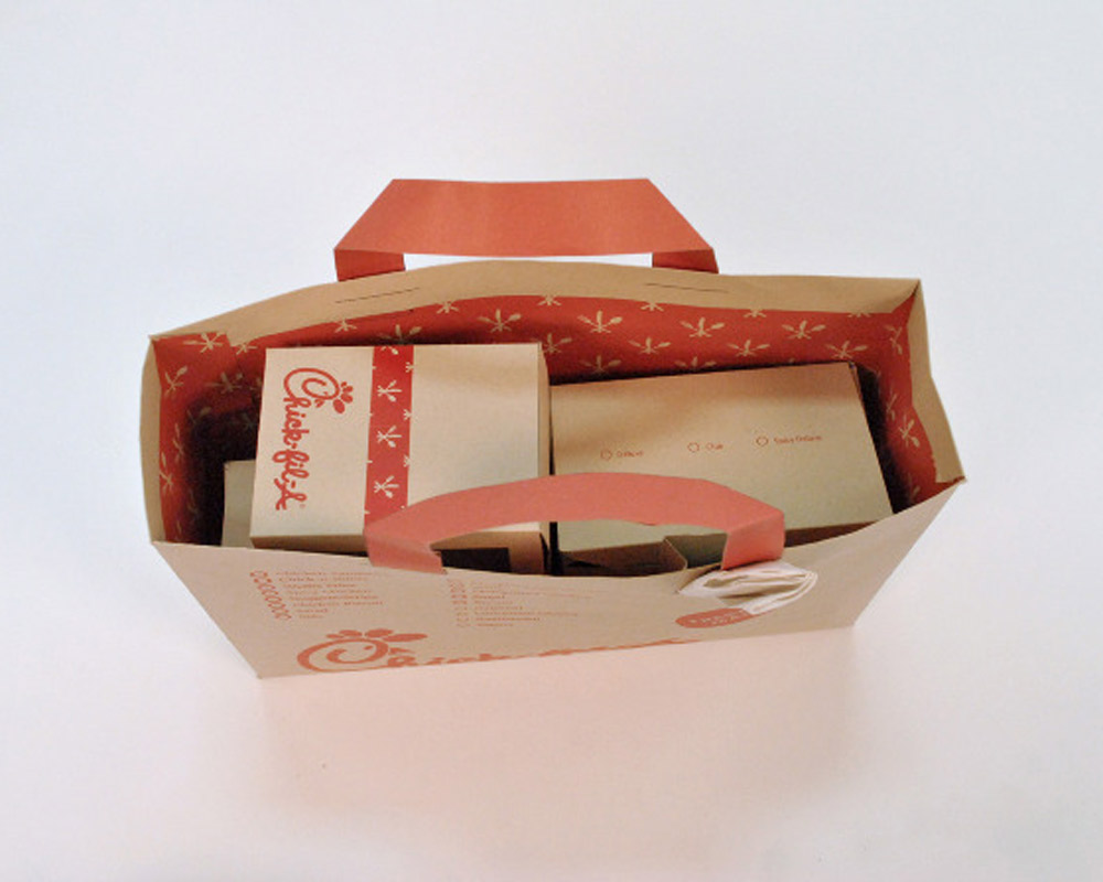
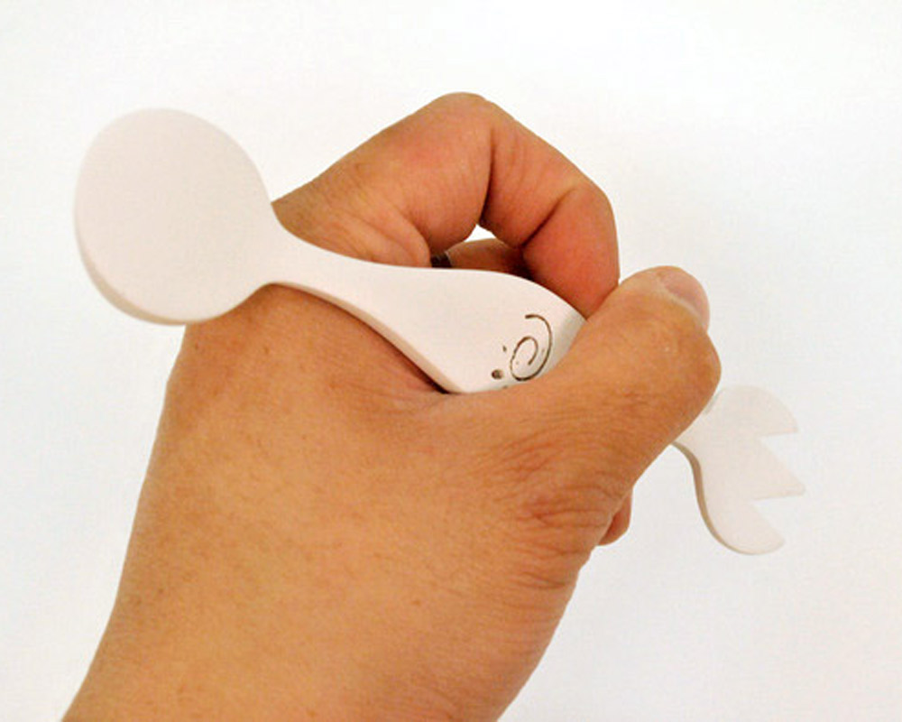
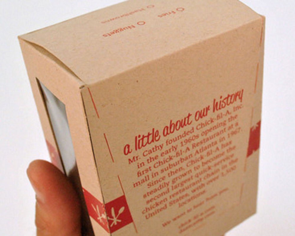
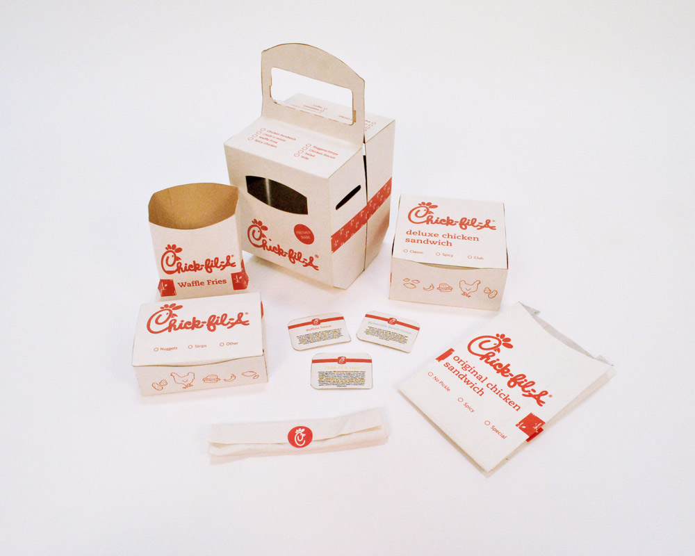
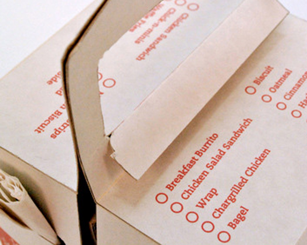
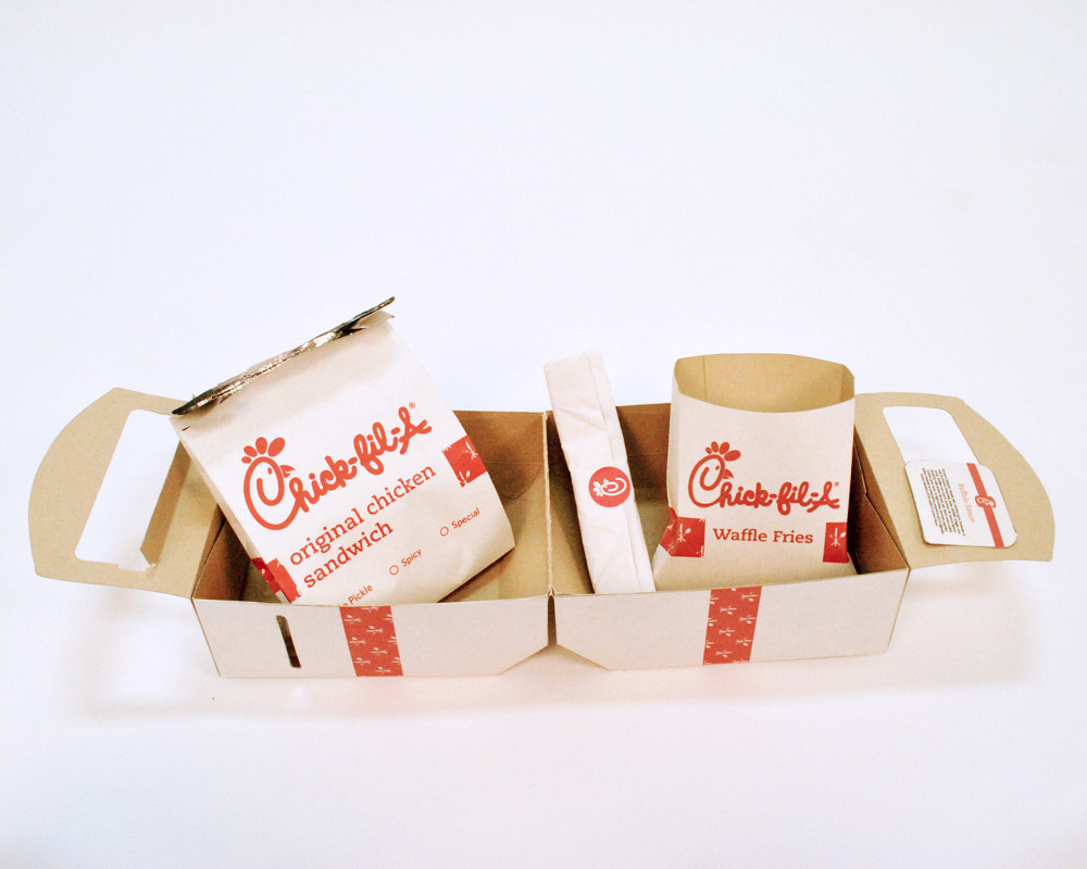
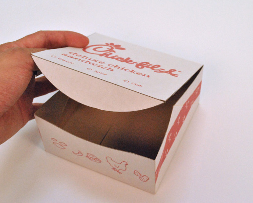
Chick-Fil-A partnered with SCAD, looking to redesign their drive-thru packaging and to increase efficiency and accuracy throughout. I worked collaboratively with an industrial designer, and together we created the best solutions for the packaging while still incorporating the brand. The biggest challenge was combining all parts of the meal into one final solution. In the end, we created two proposed ideas: one using the current packaging they have, just improving the containers, and a second, bag idea, which contains different sized boxes to hold all of the menu items.
Disclaimer: I do not share the opinions expressed by Chick-Fil-A.
Credit: Tanner Lai
The Long Shot
the long shot
n.
a venture that involves great risk but promises great rewards
This is a fictional promotional piece for the war film, The Long Shot. It was created to exemplify digital manipulation skills, the phrase “the long shot,” and reiterate the summary, while keeping the overall tone of the movie.
The summary is, a city in the future is suddenly taken over by “people” from the major war going on at the time. The main character, a man who does not want to be a part of the war but was drafted in, becomes the top marksmen. Throughout his duties he comes to realize that these “people” are altered humans to have machine like qualities. The main character is then put into a position where he might not survive if he doesn’t make the long shot.
George Washington University Patient Guide
A general guide given to every patient entering the hospital that details important information they will need to know, along with services that are offered to guests of the patient. This redesign incorporates the hospital's new branding while updating the guide with a clean, modern look.
Copyright © Universal Health Services
Pennsylvania Horticultural Society
Since their new brand roll out in January 2013, PHS needed many of their business staples to be redesigned including mailing labels, flyers and thank you cards.
Copyright © Pennsylvania Horticultural Society
Through the Zodiac
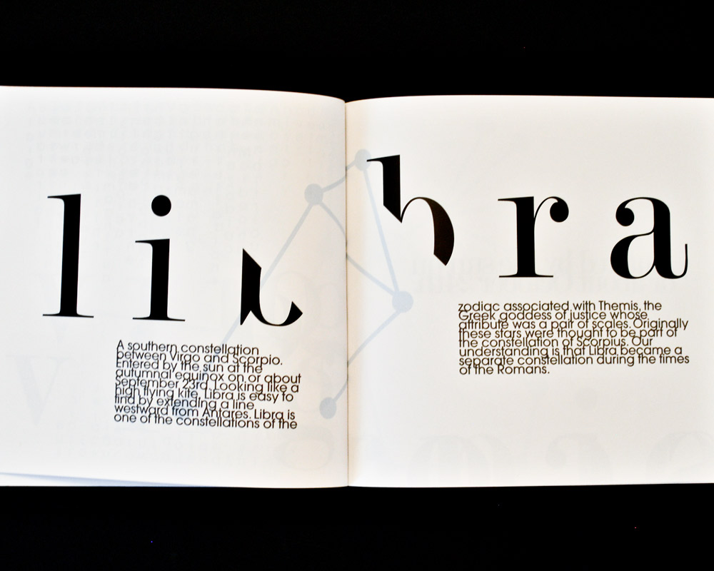
This book uses typography in unusual ways such as, experimenting with different typefaces, styles and letter forms, to create unique spreads about the zodiac. By focusing on the stories and myths behind each symbol, I illustrated layouts that embodied them.


